Design

Hand-crafted furniture

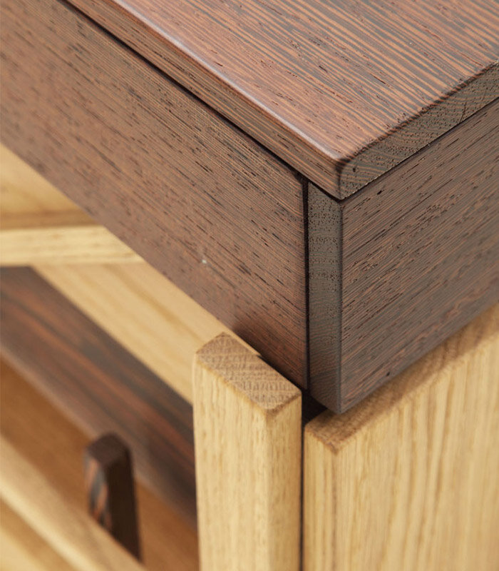
Halifax is a historic brand, born in the 90’s at the heart of Brianza, cradle of master craftsmen, manufacturers of amazing hand-crafted works thanks to their skill in selecting the best materials and their advanced know-how in woodwork. Halifax always manufactured, during the years till nowadays, a highly refined product, extremely accurate in details and in the choice of the most precious finishes.

Our attention always focused on transforming the material into a functional object and a design object at the same time. Halifax initial collection offers a range of products manufactured in solid wood, with hints of memory, like the table Winston, the vitrine Vetriera and the showcase Bacheca.
After 25 years we are re-proposing these items with alternative woods. Our heritage of beauty and unique solutions characterized by a strong personality.

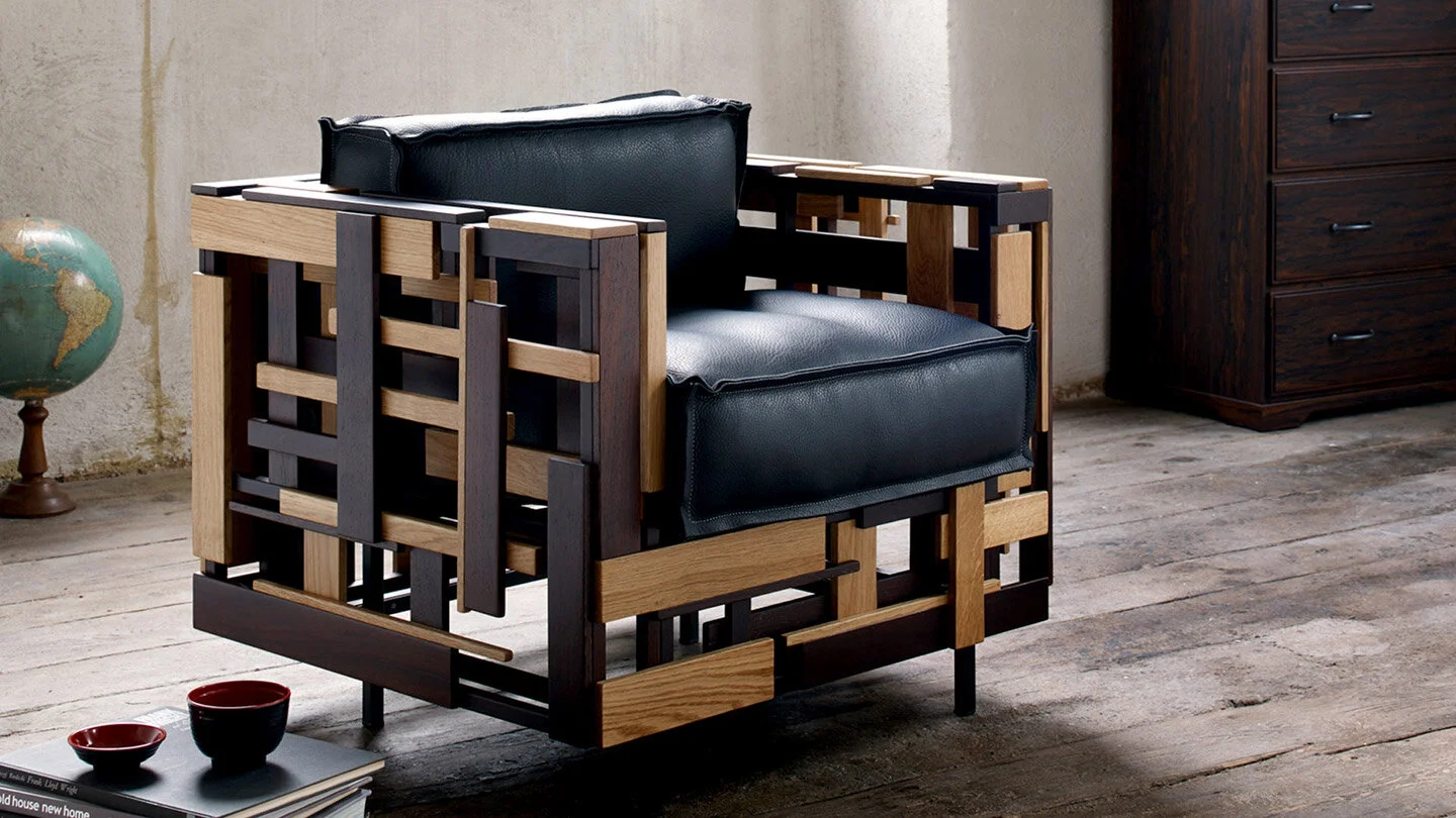
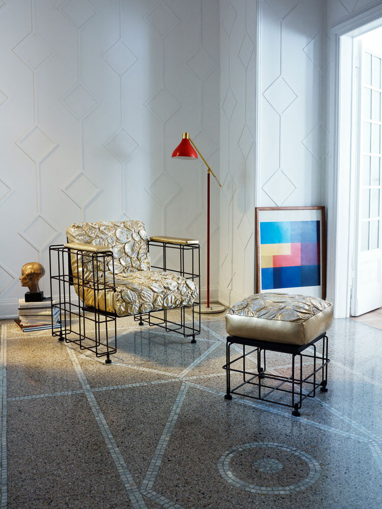
INTRECCI ARMCHAIR

Destructured armchair, made with combinations and overlaps of solid wood slats. The randomness in the application of the strips, made entirely by hand, makes this work a Masterpiece. Padded cushion and backrest. Removable fabric cover with “Bordino” stitching or removable double-edge stitching in visible leather.

Dimensions: L79 X P 75 X H76


536084_img03.gif

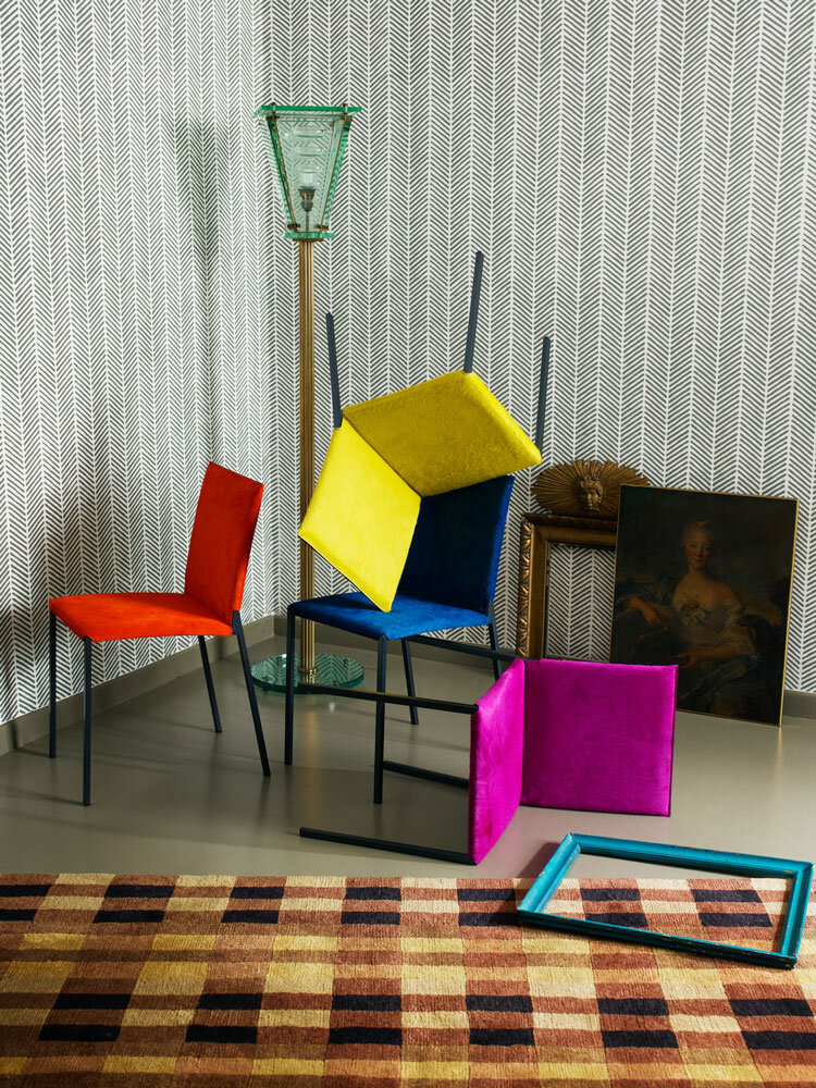
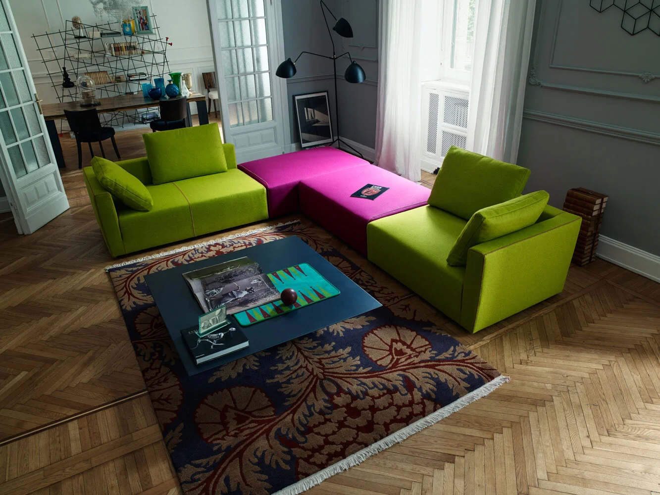
STEALTH

Sofa with irregular segments, wooden frame covered with different density polyurethane foam, cushions in polyurethane foam. Partially removable fabric cover.

Dimensions: L 320 X P 157 X H 120


536084_img04.jpg
536084_img06.jpg
536084_img05.jpg

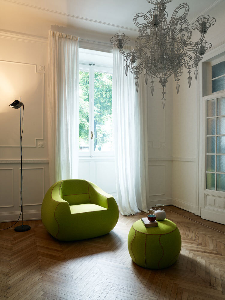
OTHER PRODUCTS BY HALIFAX

BOCCACCIO-Halifax-05-2016-21046582.jpg

Source: Halifaxgroup.it
PANTONE 19-4052 Classic Blue

Instilling calm, confidence, and connection, this enduring blue hue highlights our desire for a dependable and stable foundation on which to build as we cross the threshold into a new era.

color-pantone-2020-24912.jpg

A timeless and enduring blue hue, PANTONE 19-4052 Classic Blue is elegant in its simplicity. Suggestive of the sky at dusk, the reassuring qualities of the thought-provoking PANTONE 19-4052 Classic Blue highlight our desire for a dependable and stable foundation on which to build as we cross the threshold into a new era.

Imprinted in our psyches as a restful color, PANTONE 19-4052 Classic Blue brings a sense of peace and tranquility to the human spirit, offering refuge. Aiding concentration and bringing laser like clarity, PANTONE 19-4052 Classic Blue re-centers our thoughts. A reflective blue tone, Classic Blue fosters resilience.

As technology continues to race ahead of the human ability to process it all, it is easy to understand why we gravitate to colors that are honest and offer the promise of protection. Non-aggressive and easily relatable, the trusted PANTONE 19-4052 Classic Blue lends itself to relaxed interaction. Associated with the return of another day, this universal favorite is comfortably embraced.

About Pantone Color of the Year

For over 20 years, Pantone’s Color of the Year has influenced product development and purchasing decisions in multiple industries, including fashion, home furnishings, and industrial design, as well as product packaging and graphic design.

The Pantone Color of the Year selection process requires thoughtful consideration and trend analysis. To arrive at the selection each year, Pantone’s color experts at the Pantone Color Institute comb the world looking for new color influences. This can include the entertainment industry and films in production, traveling art collections and new artists, fashion, all areas of design, popular travel destinations, as well as new lifestyles, playstyles, and socio-economic conditions. Influences may also stem from new technologies, materials, textures, and effects that impact color, relevant social media platforms and even upcoming sporting events that capture worldwide attention.

About The Pantone Color Institute™

The Pantone Color Institute is the business unit within Pantone that highlights the top seasonal runway colors, selects the Pantone Color of the Year, forecasts global color trends, and advises companies on color for product and brand visual identity. Through seasonal trend forecasts, color psychology, and color consulting, the Pantone Color Institute partners with global brands to effectively leverage the power, psychology, and emotion of color in their design strategy.

Source: www.pantone.com

This modern Healthcare Startup Is Using Design to Heal

Parsley Health's latest space is a cheerful take on the doctor's office

By Kara Ladd Photography by Trevor Tondro | November 14, 2019

The lounge area of Parsley Health's new Los Angeles flagship features natural elements like a caned chair by Hansen + Hyldahl for Norr11 and Workstead's Lodge chandelier designed to put patients at ease before being treated.

The lounge area of Parsley Health's new Los Angeles flagship features natural elements like a caned chair by Hansen + Hyldahl for Norr11 and Workstead's Lodge chandelier designed to put patients at ease before being treated.

Visiting the doctor is never pleasant. Even less so when your physician’s beige, cramped office space hasn’t been updated in decades and comes with a signature scent you can’t quite identify—and perhaps don’t want to. Parsley Health aims to change that dreaded experience. As a modern primary-care practice that strives to reinvent stereotypically sterile doctor’s offices, it is leveraging the interiors world’s latest trend—biophilic design. The term biophilia, coined by biologist Edward O. Wilson in the early ’80s, refers to the hypothesis that humans have a biological affinity to nature. Thus, biophilic design bridges the gap between the great outdoors and the great indoors, incorporating eco-inspired aesthetics into spaces like your home, work, and now your doctor’s office. “We’re trying to bring the outside inside,” says Alda Ly, founder of Alda Ly Architecture & Design and the architect behind Parsley Health.

Slatted partitions allow the natural light from the waiting room to flood the reception area, and a sunny yellow lamp by Verner Panton greets patients.

Slatted partitions allow the natural light from the waiting room to flood the reception area, and a sunny yellow lamp by Verner Panton greets patients.

The conscious-meets-corporate company launched their first custom-designed flagship on Fifth Avenue in New York City earlier this year and recently opened their West Coast flagship in Los Angeles in October. Parsley also has a center in San Francisco and offers online-only doctor's visits nationally. The Parsley Health team had a grassroots vision for its latest space, utilizing healing biophilic design components proven to produce positive health effects on patients—think plenty of plants, chromotherapy, and fluid architecture.

The cheery café offers kombucha on tap and healthy snacks.

The cheery café offers kombucha on tap and healthy snacks.

Common features of a doctor’s office, like the cold, uninviting exam table, proved to be an exciting challenge for the design team.

Common features of a doctor’s office, like the cold, uninviting exam table, proved to be an exciting challenge for the design team.

If you think about it, there's no better time for biophilic design: The more we lean into rapid innovation and urban industrialization, the more we inherently yearn for interior odes to Mother Nature. And according to the American Stress Institute, 70–90% of all visits to primary-care physicians are due to stress-related issues, so it’s only natural that health care centers would be designed as calm havens for patients, to take the edge off while they’re being treated. “We need to lessen our anxiety, live more consciously, and celebrate and protect the natural beauty of our planet," says Hilary Koyfamn, Parsley Health’s interior designer and founder of Hilko Designs. "Bringing this ethos into our spaces is a natural extension of that mindset.”

Take cues from the welcoming waiting area and furnish your own space with rounded-edge furniture, natural materials like rattan, and plenty of greenery.

Take cues from the welcoming waiting area and furnish your own space with rounded-edge furniture, natural materials like rattan, and plenty of greenery.

Parsley Health’s 2,500-square-foot Los Angeles space is modern yet inviting, resembling more of a chic coworking space or delightful brunch spot rather than a place to get your medical concerns off your chest. The floor-to-ceiling windows act as a floodgate to streams of natural light that shine on a jungle of potted plants, purposefully placed around the office. The design incorporates a mindful balance of neutral hues and pops of pastels on natural textiles, anchored with grounding stone and wood accents.


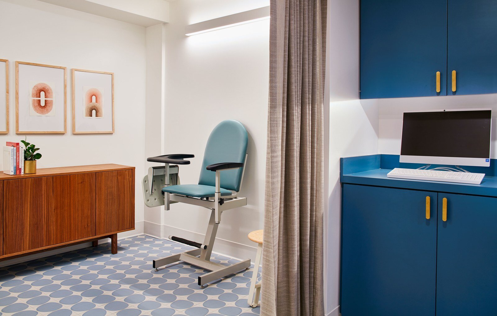
The often-feared blood-draw room is decorated with ocean blue cabinetry and tiles, and warm wood furniture to echo the local Southern California environment.

The often-feared blood-draw room is decorated with ocean blue cabinetry and tiles, and warm wood furniture to echo the local Southern California environment.

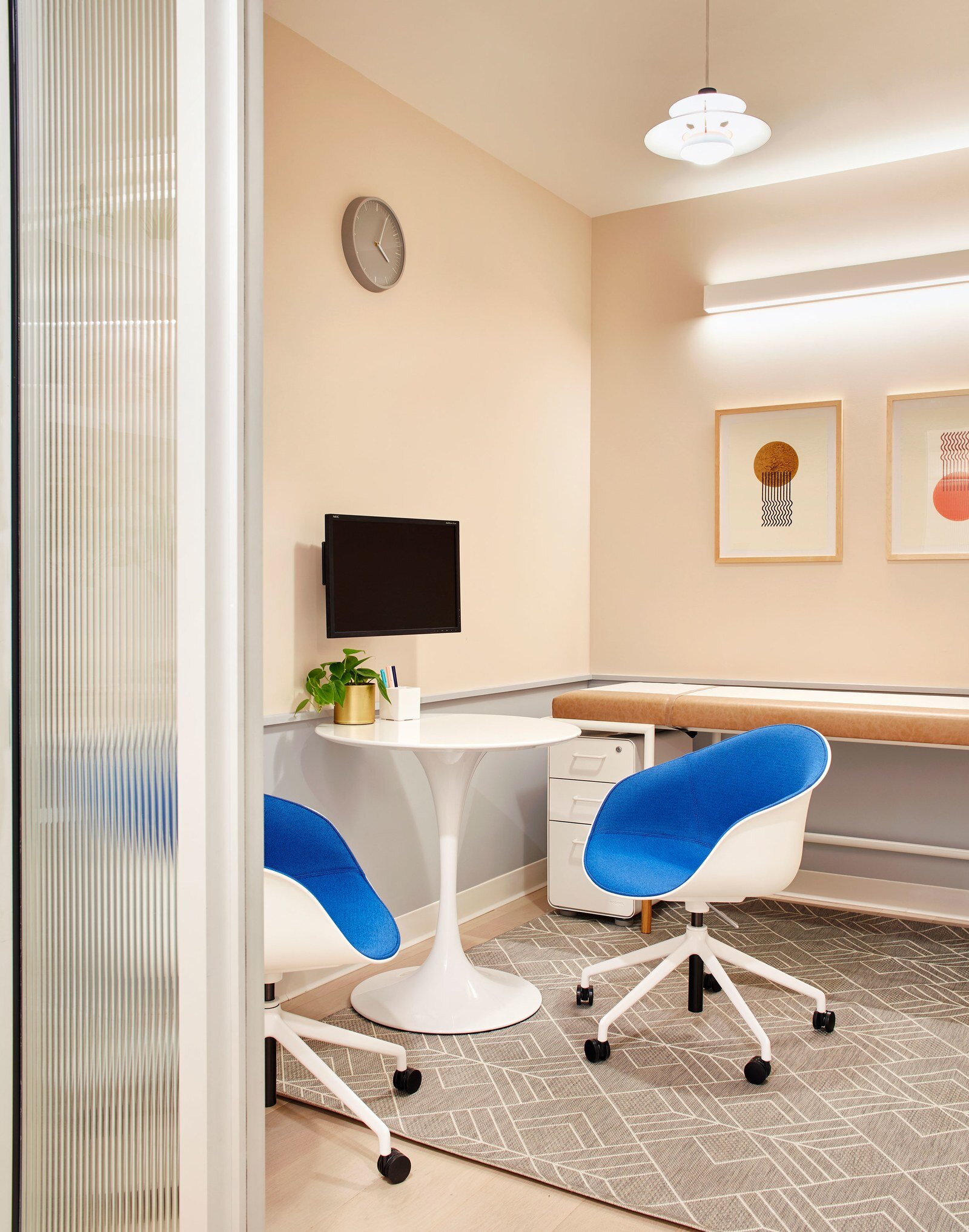
“The L.A. flagship was inspired by both the dusty desert and rich ocean colors of California’s landscape, which are apparent in the warm fabrics and blue cabinetry throughout the space,” says Alda. “We paid close attention to the color palette to instill a sense of calm, activating a parasympathetic state, otherwise known as rest-and-relaxation,” adds Hilary. That palette includes Benjamin Moore's Misty Gray, Soft Chinchilla and Monticello Rose. Particular attention was also paid to anxiety-inducing elements of every doctor’s office like the exam table. “I wanted to change the language and make it feel cozy using soft edges, warm materials, and inviting color to ease anxiety rather than exacerbate it,” says Hilary.

“We want to make sure that both the patients and doctors feel calm and supported by the space they are in,” says Alda

“We want to make sure that both the patients and doctors feel calm and supported by the space they are in,” says Alda

Of course, one of the biggest hurdles in designing a service-based spaced is balancing aesthetics with functionality. “We wanted to fit as much programming as possible while maintaining a healing atmosphere. Through multiple iterations, we found a layout that integrated the long central hallway—also found in the NYC location—an open kitchen, and a spacious reception and retail wall,” says Alda.

Pastel-painted visit rooms are designed for two-way conversation.

Pastel-painted visit rooms are designed for two-way conversation.

A bathroom features punchy blue countertops and a millennial pink sink.

A bathroom features punchy blue countertops and a millennial pink sink.

The wellness industry is worth more than $4.2 trillion, so this can only be the beginning of biophilic design in professional and public spaces. Soon enough it will transcend beyond the confines of yoga studios, juice bars, and meditation spaces and into high-traffic, powerful places of purpose. “It would be incredible to see this evidence-based design in schools, hospitals, and service buildings,” says Alda. Who wouldn't look forward to their annual physicals at this doctor's office?

A zen-like hallway leading to exam rooms mimics natural sunlight in order to instill a sense of calm.

A zen-like hallway leading to exam rooms mimics natural sunlight in order to instill a sense of calm.

Source: Clever